
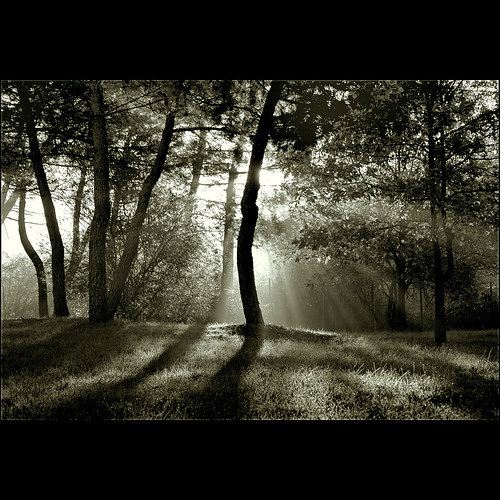


Chiaroscuro in art is “an Italian term which literally means ‘light-dark’. In paintings the description refers to clear tonal contrasts which are often used to suggest the volume and modeling of the subjects depicted.” Wikipedia[1]
Tonal contrasts are about the relationship between light and dark. When images are said to have Chiaroscuro you can expect to see strong contrasts as each area or shape compares with the adjacent area or shape. Van Gogh–“…. there is no better education than painting outdoors; you must always compare things thoroughly with one another, especially in tone. Painting is like algebra; that is to that as that is to that.” Not that I’m asking you to think about algebra, but rather picture a Rembrandt self-portrait or the Vermeer we were looking at the other day. Leave color out of it– Van Gogh says: “And then I do not know how you will handle your colors, but that matters little.”
Various kinds of light and shadow:
- cast shadow-this is the kind of shadow that chases you on a summer day
- form shadow-this is the kind of shadow that doesn’t get any light. Like the dark side of the moon.
- value-the quality of lightness or darkness of a mark or shape.
- edges-the boundary between shapes.
- highlight-the reflection of the light source on an object.
- light side- the part of an object receiving direct light
- dark side- the part of an object opposite the light source
- reflected light-subtle light bouncing back into the shadow
- core shadow- the darkest part of a shadow sandwiched between the light side and reflected light
- value gradation– The slow transition from one shade to another.
This week we are going to play with chiaroscuro. I recommend a fresh sheet of paper—not too big, so you can really play with this idea. Canvas is ok, but more challenging. The deck is open if anyone wants to work outside as Van Gogh suggests. We have drawing board if you want to sketch outdoors then bring it in to paint.
Perfect timing—the HUGE chunks of charcoal are in for those who ordered them.
